Apple this week released the first iOS 15 beta to developers, and away from the brouhaha surrounding its many tentpole features, many notable tweaks and improvements are continuing to be uncovered. Here, we've pulled out a few that we think are worth highlighting.
Bear in mind that Apple hasn't mentioned all of these changes in its iOS 15 marketing, and there's no guarantee that they'll make the final cut when iOS 15 is released to the public in the fall.
Original Wheel Picker Returns
In iOS 14, Apple removed the original large wheel-style dial picker used for selecting times, and replaced it with a smaller dial picker that's sort of hidden behind a boxed number input field. This new design was supposed to unify the two selection modes, but it also made it somewhat slower to wheel through numbers.
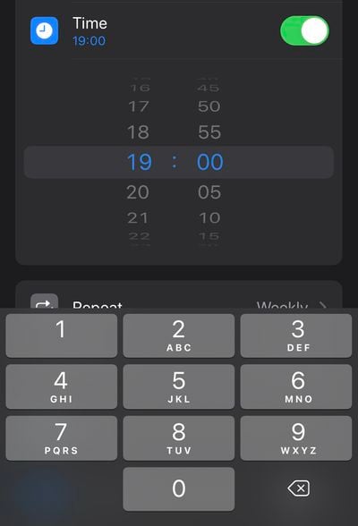
Happily, iOS 15 sees the return of the larger dial picker, but with a neater, more modern design. You can also tap the wheel to input digits with the number pad, so it basically retains the added functionality of the less-coveted version seen in iOS 14.
Custom Text Size Per App
In iOS 14, you can add a button to the Control Center that allows you to change the text size on the screen on the fly. Any change that you make is reflected systemwide regardless of your preference, but in iOS 15 that's no longer the case.
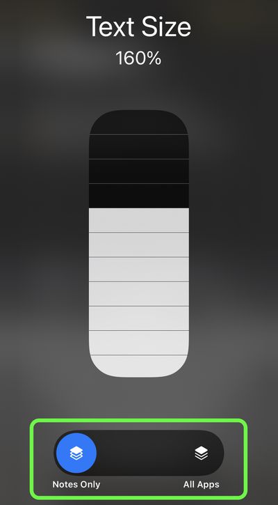
Bring up the Text Size selector in Control Center, and you'll see new options to apply the text size adjustment to the system, or just the app that's currently open. iOS 15 will also remember your selection, so you can exit out of the app to do something else and then return to it with your chosen text size for that particular app intact.
Text Selection Magnifier Returns
After its removal in iOS 13, Apple has reintroduced a new version of the magnifying glass for text selection. The new magnifier is a little smaller than the original one, but the fact that it has reappeared is likely to be welcomed.

From a user perspective, removing the loupe felt like an odd decision on Apple's part, as it makes it harder to see where the cursor is situated under your finger. Fortunately, this tweak is likely to stay, since Apple lists it as a feature on its iOS 15 page.
Drag Apps From Spotlight to Home Screen
In iOS 14, the functionality of app icons that appear in Siri Suggestions and Spotlight search results is limited to opening the app. In iOS 15, however, it's possible to drag an app from Spotlight and place it right onto the Home Screen, which means you no longer need to continually drag app icons between Home Screen pages to rearrange them.
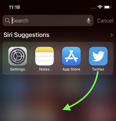
You can also now directly delete apps from within Spotlight via a long-press Quick Action that wasn't available in previous versions of iOS, meaning you can make short work of any apps that have lain forgotten in your App Library.


