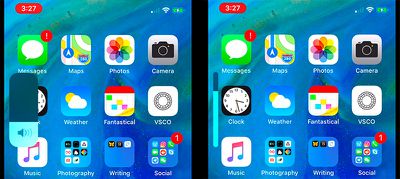
Here's the New iOS 13 Volume Indicator
As rumored, the new iOS 13 update (and the new iPadOS update) feature an updated volume HUD, which is less obtrusive than the previous volume control option that's been in iOS forever.
The new volume interface takes up much less room on the display, expanding from a small bar at the side of the display when you first press the volume up or down buttons into an even thinner bar as you keep adjusting the volume.

In portrait mode, this new volume HUD is located at the left side of the iOS device, both on the Home screen and within apps.
When you're adjusting the volume with the iPhone held in landscape mode with a landscape mode app, the volume interface appears at the top of the display.
An updated volume interface is a feature that iOS users have been wanting for years, and iOS 13 definitely delivers a more streamlined volume experience that should be a relief for those tired of seeing a giant volume indicator in the middle of the display.
Popular Stories
Apple typically releases its new iPhone series around mid-September, which means we are about two months out from the launch of the iPhone 16. Like the iPhone 15 series, this year's lineup is expected to stick with four models – iPhone 16, iPhone 16 Plus, iPhone 16 Pro, and iPhone 16 Pro Max – although there are plenty of design differences and new features to take into account. To bring ...
Apple is today providing developers with the first betas of iOS 18.1, iPadOS 18.1, and macOS Sequoia 15.1, with the new software introducing an early version of the Apple Intelligence features. These new betas will be in testing alongside the current iOS 18, iPadOS 18, and macOS Sequoia 15 betas. Developers can choose whether to opt into the new betas with Apple Intelligence, or stay on the ...
Apple Intelligence will miss its initial expected launch date to give Apple more time to fix bugs, Bloomberg's Mark Gurman reports. According to individuals with knowledge about Apple's plans, the company now plans to start rolling out Apple Intelligence in software updates by October, arriving several weeks after the launch of iOS 18, iPadOS 18, and macOS Sequoia. This means that Apple...
T-Mobile customers have filed a lawsuit [PDF] against the carrier, alleging that it failed to honor a guarantee not to raise the prices of select cellular plans. The lawsuit, first spotted by Wired, claims that back in 2017, T-Mobile advertised several of its plans with a price lock, but then went on to increase prices starting in May 2024. "T-Mobile ONE customers keep their price until...


