iOS 14 introduces several compact user interface elements that iPhone users have been requesting for years, such as a minimized phone call pop up that doesn't take over the entire screen and a smaller Siri window that doesn't dominate the display.
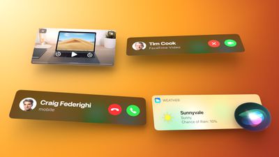
This guide covers all of the new compact UI elements that Apple has added, but for more details on iOS 14 design changes, make sure to check out our Home Screen guide and our full iOS 14 roundup.
Phone Calls
When you're in the middle of using your iPhone and a phone call comes in, it's frustrating to have the incoming call take over the iPhone's display, especially if it's a spam call that you don't care about.
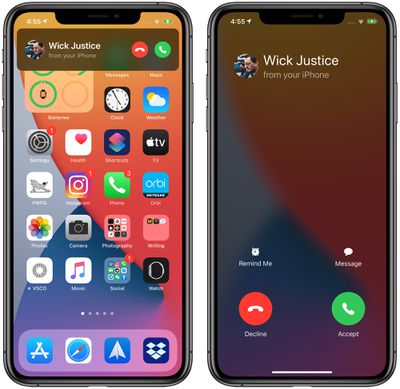
That's no longer a problem in iOS 14, because incoming phone calls are shown in a notification banner rather than a full incoming phone call display like in iOS 13.
Phone calls are only shown in banner format when your phone is unlocked and in use, so when your iPhone is locked, the Lock Screen interface where with the slide to unlock bar is still present.
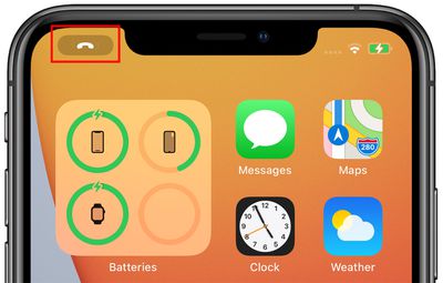
You can tap on the decline button of incoming phone call banner to decline the call right away. Tapping on the accept button activates the call right in the banner interface, but if you tap outside of the accept/reject buttons the call opens in full screen as normal. If you swipe the banner away, you can continue to use your iPhone as normal while the phone rings in the background with a small icon shown over the time at the top left of the display.
If you tap a phone call banner and open the full display interface, you'll need to accept or decline the call to get out of the phone call view. If you've swiped the banner away, you can tap on the call icon in the upper left corner of the display to get to the call interface.
FaceTime Calls
Incoming FaceTime calls in iOS 14 look the same as incoming phone calls when the iPhone is in use, showing up as a banner that can be swiped away or tapped to accept or decline a call. Note that FaceTime calls only show up in banner format when the iPhone is unlocked and in use. On the Lock Screen, FaceTime calls continue to take up the whole screen and will activate the camera.
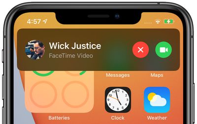
Tapping on a FaceTime call banner will extend the FaceTime call interface to the entire display as it works in iOS 13, where you can either decide to accept or decline the call. Tapping right on the "X" button will automatically decline the call from the banner, however.
Swiping the FaceTime banner away allows the FaceTime call to continue ringing in the background without disturbing you. You'll see the FaceTime icon over the time in the upper left corner of the display, which you can tap to get back to the FaceTime interface if you want to accept or decline the call. Otherwise, it rings in the background for a few seconds until it registers that you're not picking up.
![]()
Once you've tapped on a FaceTime call banner or icon, the FaceTime call expands to the full display and the only way to get out of the interface is to accept or decline the FaceTime call.
Third-Party VOIP Calls
Apple created a new API for the collapsed call interface that will let developers incorporate the feature into third-party VOIP apps like Facebook Messenger, WhatsApp, Skype, and tons more.
App developers will need to implement this API into their apps before their apps will be shown with the updated call interface.
Picture in Picture
Apple considers the new Picture in Picture mode on iPhone to be part of the updated compact user interface in iOS 14. With Picture in Picture mode you can watch TV shows, movies, and videos from apps and the web while doing other things on your iPhone with the content shown in a windowed view.
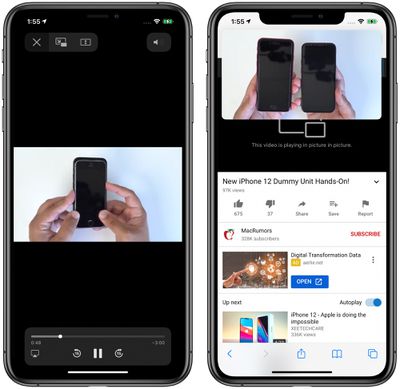
There's a FaceTime Picture in Picture feature that's even more useful because there's now a way to carry on a FaceTime conversation while also using your iPhone as normal. In iOS 13, exiting out of the FaceTime app pauses the FaceTime video for the person you're speaking with, but in iOS 14, exiting out of FaceTime collapses the video view into a small window so both parties can continue their discussion.
We have a Picture in Picture guide with complete details on how the feature works, so make sure to check that out for more info on the Picture in Picture feature.
Siri
Siri requests in iOS 14 are also part of the compact interface, and activating Siri no longer takes over the entire iPhone. Instead, when you activate Siri through a "Hey Siri" voice command or through a physical button, a circular, animated Siri icon pops up at the bottom of the iPhone's display.
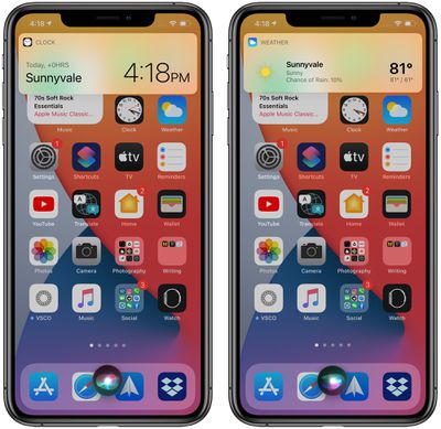
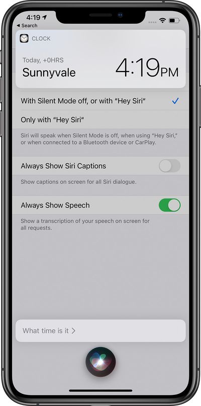
The Siri icon moves as you speak to Siri so you can be sure the voice assistant is listening and picking up what you have to say. Queries are also displayed in a more compact view with information provided at the top in a banner format.
If, for example, you ask Siri the time or the weather, the information is shown in a banner-style popup at the top of the display.
Shorter information is shown in smaller banners, but longer questions may have banners that take up more space. This is especially true of results that involve web searches.
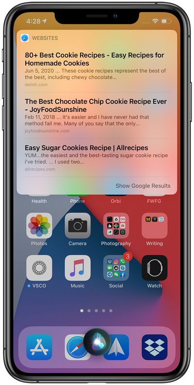
Certain requests, such as those that show off Siri's personality like jokes or product information requests, show the results right above the Siri icon.
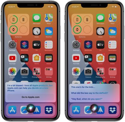
Note that in iOS 14, Siri does not display the text of what you've spoken in order to keep the interface as small as possible, but if you enable the "Always Show Speech" feature, what you're speaking will show up in a small popup over the Siri icon. It's useful to see what Siri hears to make sure the voice assistant is properly interpreting commands.
Turn on "Always Show Speech" by opening up Settings, going to Siri & Search, tapping on Siri Feedback and then toggling on the speech option. You can also turn on captions, which will show captions for all spoken text.
In any Siri result, while the Siri interface leaves the background of the iPhone visible so you can continue to see what you were doing prior to the Siri request, there is no option to interact with other apps while the Siri interface is open. Attempting to tap elsewhere on the display while Siri is active closes the Siri interface.
After activating Siri the first time with a voice command or a physical button, the Siri interface stays open until you tap out of it, so you can tap on the Siri icon to initiate another Siri request. With Siri results that are interactive like web search results or translations, you can tap in the Siri window to execute the search, hear the spoken translation, and more. All in all, Siri in iOS 14 works much the same as it does in iOS 13, but in a way that feels like it's less of an interruption to general iPhone and iPad usage.
Along with the redesign, Siri has a few other new features in iOS 14 such as support for sending audio messages, getting cycling directions, and sharing an Apple Maps ETA with a contact, with how tos covering these new features available below.
- iOS 14: How to Send an Audio Message Using Siri
- How to Get Siri to Transcribe Your Requests in iOS 14
- How to Get Cycling Directions From Siri in iOS 14
- How to Ask Siri to Share Your ETA When Navigating With Apple Maps
Guide Feedback
Have questions about the interface changes in iOS 14, know of a feature we left out, or want to offer feedback on this guide? Send us an email here. For more on everything new in iOS 14, make sure to check out our iOS 14 roundup and our other iOS 14 guides.


