The massively popular F-150 pickup truck was one of the first Ford vehicles to gain the manufacturer's new SYNC 4 infotainment system for the 2021 model year, and I recently had a chance to test out the vehicle to get a sense of how the overall system functions, including a key new feature for iPhone owners: wireless CarPlay.
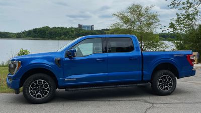
If you've shopped pickup trucks before, you know that they come in a huge array of configurations with different trims, cab and bed sizes, engines, and more across a range of prices. While I didn't get to test out the upcoming all-electric F-150 that's been making headlines recently, my 2021 test vehicle was a Lariat trim 4x4 with SuperCrew cab and a 3.5L PowerBoost Full Hybrid engine.
With some additional options, my tester came to a sticker price of a little over $68,000, which is toward the higher end of the F-150's expansive pricing range that starts at under $30,000 and can push past $80,000 fully loaded.
SYNC 4 Infotainment
The Lariat trim of the F-150 comes with a generous 12-inch infotainment screen for managing the SYNC 4 system and Ford says the hardware is twice as fast as that used in the SYNC 3 system. That makes for a responsive system that responds well when switching between functions and doing more intensive tasks like panning and zooming with built-in navigation.
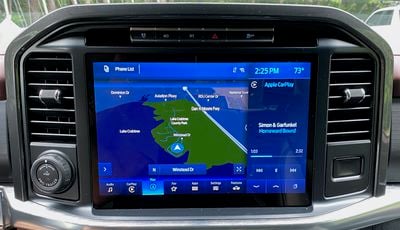 SYNC 4 with built-in navigation
SYNC 4 is also designed from the ground up to be scalable across display sizes and aspect ratios, from the relatively traditional 8-inch and 12-inch display options in the F-150 to the large portrait-style screens in the Edge and Mustang Mach-E that get a slightly modified SYNC 4A system.
The overall look of SYNC 4 is quite similar to SYNC 3, with a simple look that generally lacks significant contrast and forgoes the increasingly common dashboard/widget home screen view for a split-screen view that allows you to see two functions simultaneously and easily switch between them using icons along the bottom of the display.
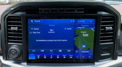 SYNC 4 split-screen with radio and built-in navigation
I've come to prefer dashboard-style views that make it easy to see a variety of information all at once, but I must say that the ability to easily swap between functions, including CarPlay, using the persistent navigation bar did grow on me over my time with the vehicle.
SYNC 4 offers both light and dark color schemes, and the system can be set to automatically switch between them depending on the time of day. I must say that I was not a fan of the light color scheme, even during the daytime, as it simply felt like too much light gray with not enough contrast among various elements and even the background. I much preferred the dark theme with its heavy emphasis on blue, which felt better to my eyes regardless of the time of day.
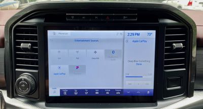 SYNC 4 light theme
SYNC 4 benefits from not being overly complicated, even though there are a number of advanced features thanks to it being installed in an F-150, such as controlling the onboard generator system, exterior work lighting, and more. But for general use, there aren't a ton of functions you'll need to access on a regular basis.
In addition to the large touchscreen, there is a set of buttons and knobs below it for controlling various audio functions like volume, tuning, play/pause, skipping forward and backward, changing audio sources, and accessing audio settings. Several of these functions can of course also be controlled using buttons on the steering wheel.
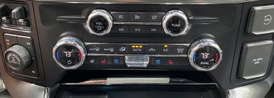 Manual buttons and knobs for audio and climate control
Climate controls are thankfully manual, with generous knobs for setting the temperature and an assortment of buttons for various modes including heated and ventilated seats and the heated steering wheel. An easy-to-find rocker in the center of the grouping helps you quickly adjust the fan speed while minimizing the need to take your eyes off the road.
CarPlay
As is becoming increasingly common across the latest infotainment platforms, SYNC 4 supports both wired and wireless CarPlay, offering maximum flexibility for phone integration. Wireless setup is simple, requiring only a quick pairing confirmation via Bluetooth before the Wi-Fi connection is made. From that point on, I experienced quick and seamless connection every time I started the vehicle.
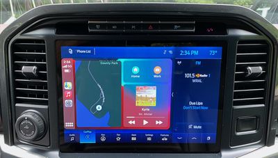 CarPlay dashboard view
With the F-150's 12-inch screen divided into several sections with the split-screen view on the left and right, persistent navigation bar at the bottom, and fairly large status bar at the top, CarPlay feels like it takes up a relatively small portion of the overall screen real estate. It's certainly functional, but you won't get the expansive CarPlay experience you see on some other vehicles where it can display in widescreen at greater resolution.
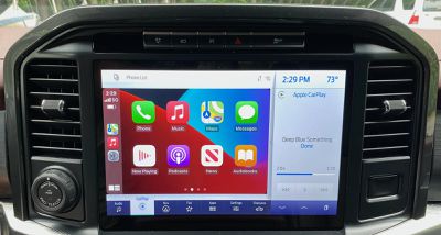 CarPlay home screen
CarPlay also looks a little out of place against the relatively monochrome SYNC 4 system that takes up the rest of the screen. But CarPlay performs well, and I noticed no lag or other issues when using either a wired or wireless connection.
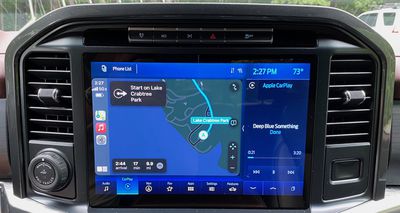 Apple Maps in CarPlay
While CarPlay itself is limited to only a portion of the SYNC 4 display, it does an adequate job of displaying content, including navigation apps. Any smaller and it would definitely feel cramped, but it gets the job done.
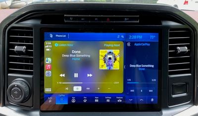 Now Playing screen in CarPlay
The main advantage of this layout for SYNC 4 is that CarPlay integrates very well with the native system. You can view secondary information like radio or SiriusXM data and controls in the split-screen view right alongside CarPlay, and jumping back and forth between CarPlay and other SYNC functions is extremely easy thanks to the navigation bar at the bottom. You're always only one tap away from getting in or out of CarPlay.
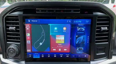 Split-screen CarPlay with options for secondary cards
In addition to the 12-inch main infotainment screen, Lariat and higher trims also include a 12-inch all-digital driver productivity screen. It's dominated by large digital tachometer and speedometer dials, but it can display some information such as native navigation prompts in the center portion of the screen. It does not support second-screen CarPlay Apple Maps navigation prompts, which is disappointing but not terribly surprising considering that feature is just starting to be supported by a few manufacturers.
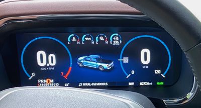 Driver's 12-inch productivity screen
Charging and Ports
The F-150 does offer an optional wireless phone charger, but unfortunately, my Lariat trim tester did not come equipped with it. The charger is included on higher-end King Ranch, Platinum, and Limited trims, and it's unfortunate that it's not available even as an option on lower trims to complement wireless CarPlay and Android Auto.
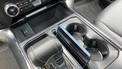 Media bin with USB-C and USB-A ports for charging and wired phone connectivity
There are three sets of USB ports through the cab, however, with each set including both a USB-C port and a USB-A port. One set for data and charging is located at the base of the center stack next to a generous media bin, which is where the wireless charging pad is located on trims that offer it. The chargers and bin have a retractable cover to help hide away valuables.
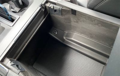 Charge-only USB-C and USB-A ports in center console
The second and third sets of USB ports are both charge-only, with one set located inside the cavernous center console compartment and the third set located on the rear of the center console for second-row passengers.
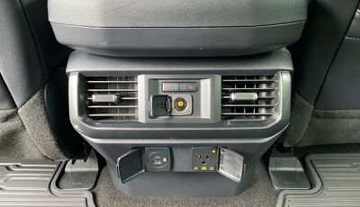 Charge-only USB-C and USB-A ports, as well as 12V and 120V power for rear passengers
My test vehicle was also equipped with Ford's 7.2 kW Pro Power Onboard system, which is exclusive to the hybrid powertrain and offers various other 120V power outlets and even a 240V outlet scattered around the cabin and in the bed of the truck, allowing the vehicle to act as a generator for power tools and other devices. Even under a full load, the system can run for up to 32 hours on a full tank of gas.
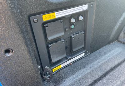 Pro Power Onboard panel in truck bed with four 120V and one 240V power outlets
Wrap-up
My feelings on SYNC 4 in the 2021 Ford F-150 can really be broken down into two parts: the look and the functionality. To put it simply, I'm not a big fan of the overall look of the system. Too much of the overall interface is relatively monochrome, which results in a boring look and makes it harder to pick out information and interactive elements. I particularly don't like the light theme and its fairly bright gray look, while the dark theme's blue offers a bit more character but is still too much of one color for my tastes.
On the functionality side, I found SYNC 4 to be a very solid system that was easy to use, even considering some of the extra features included thanks to the F-150 being a workhorse pickup. The system is responsive and I appreciate the flexibility of a split-screen view that gives access to both CarPlay and the native system simultaneously.
My initial disappointment at a lack of a dashboard-style view quickly gave way to an appreciation of how the split-screen view and the persistent navigation bar make it easy to switch between functions and make CarPlay feel like just another app, even if the look is wildly different from the native system.
If I have one issue with the functionality, it's that I'd like to see a bit better use of space in the overall design. There's an awful lot of wasted space along the top of the screen, and I'd like to see a different layout on a screen with perhaps a bit different aspect ratio that would allow for a wider and larger CarPlay pane within the system.
When it comes to connectivity, the F-150 certainly offers an array of ports to help keep devices connected and charged, and of course, wireless CarPlay is a convenient option that's great to see standard across all trims.
I do wish wireless phone charging wasn't limited to only the higher trim levels, as it seemed a bit silly to me to be driving a vehicle with a sticker price approaching $70,000 but which didn't even offer the feature as an option on that trim. I'm still a firm believer that wireless phone charging should at least be an option if not standard on any vehicle that includes wireless CarPlay and Android Auto.






Top Rated Comments
Why is it not full screen?
https://developer.apple.com/design/human-interface-guidelines/carplay/visual-design/layout/
They could have easlily used a 16x9 resolution and moved the rest of the infotainment information below the CarPlay interface. This is just terrible UI.
Also I hope you can go full screen with the CarPlay, if not, I'm not sure why Apple would approve this.(I'm assuming that because this has to be licensed, Apple gets final word on implementation.)
Our new 2021 Chevy Suburban takes up the whole screen tho... 10 inches or so... its massive and great! (Wireless too)