Toyota and its luxury brand Lexus are starting to roll out an all-new infotainment system with large touchscreens, wireless CarPlay and Android Auto, and more, and I recently had a chance to go hands-on with one of the first vehicles to get the new system, the 2022 Lexus NX.
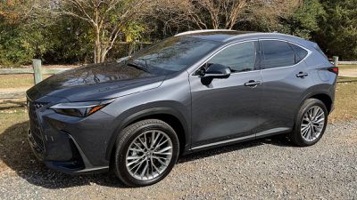
My test vehicle was an NX 450h+ AWD plug-in hybrid priced at nearly $60,000 that comes with a spacious 14-inch main infotainment display. Lower trims of the NX come with a standard 9.8-inch display that can be upgraded to the 14-inch one.
Lexus Interface
The infotainment system is similar on Toyota and Lexus vehicles, and it's known as Lexus Interface on the luxury brand. The system delivers a modern, clean look that's heavy on light gray backgrounds during the day and dark gray at night.
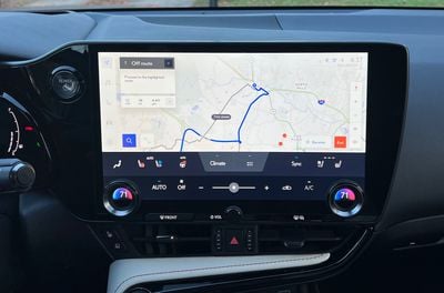
For the NX, Lexus has opted to go for a very streamlined look for the dashboard that incorporates most of the climate controls into the main infotainment screen. On some other vehicles such as the 2022 Toyota Tundra with essentially the same system, climate controls remain primarily hard buttons below the infotainment screen, so Toyota is being somewhat flexible depending on what it believes the target market for each vehicle will prefer.
I typically prefer hardware climate controls that can be operated largely by feel, but Toyota and Lexus have done a good job with the new system. The driver and passenger have hardware rings in the respective lower corners of the infotainment screen that let them set their preferred temperatures. The front and rear defrosters are controlled by small buttons underneath the display, so the most commonly used features are still tactile, and even the other software controls are laid out well and easy to use.
Unlike many other modern infotainment systems, Toyota and Lexus have opted not to offer a home screen or dashboard view, meaning you can only view information from one main app (other than the persistent climate controls) at a time. A small strip along the left side of the screen lets you hop among CarPlay (if connected), navigation, audio, phone, vehicle controls, and settings.
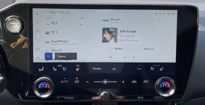
For built-in navigation, Toyota and Lexus have partnered with Google for the POI database, which means the system does an excellent job of finding destinations compared to many other systems that frequently struggle with that task.
As with many other infotainment systems, this one also supports voice control that can be triggered with a button press or a simple "Hey Lexus" voice command. It supports a broad array of functions from navigation and phone to audio, climate, and vehicle settings, and it worked very well in my testing.
The Lexus navigation system is cloud-based, which means it can be dynamically updated, but it requires a Drive Connect subscription package that also includes the cloud-based Intelligent Assistant functionality for expanded voice control with natural language processing. It also includes Destination Assist, which offers 24/7 access to live agents who can help with finding addresses, businesses, or POIs and sending them directly to your navigation system.
The Drive Connect subscription is priced at $16 per month, but vehicles equipped with the larger 14-inch display get three years of access included. Vehicles with the smaller 9.8-inch screen do not receive a trial period.
Lexus also offers several other subscription services including an $8/month Safety Connect package with features like automatic crash notifications, collision assistance, and stolen vehicle location, and an $8/month Remote Connect package with features like a digital key, remote start/stop and lock/unlock, and more, managed through the Lexus smartphone app. Both packages are included as three-year trials on all trims before you'll need to start paying.
Speaking of digital keys, Lexus is also rolling out shared digital keys in early 2022, which will let you use the Lexus smartphone app to share vehicle access with up to seven other people, making it easy to allow friends or family to use your vehicle as necessary without having to give them physical keys.
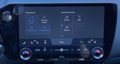
The Lexus Interface also supports over-the-air updates, so Toyota will be able to push not only bug fixes but also new features over time as the screen, processing power, and other hardware features are all designed with sufficient capabilities for the future. It's a nice step forward to make your car's systems feel more like a phone that is able to gain new functionality over time rather than being largely fixed based on what was available at the time of purchase.
CarPlay
Wireless CarPlay was simple to set up, as expected, automatically configuring itself with just a few prompts upon connecting the phone and car via Bluetooth. From that point on, things were pretty much seamless, with CarPlay showing up quickly each time upon starting the vehicle.
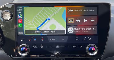
When active, CarPlay takes over the majority of the massive infotainment in a super widescreen format, with the climate controls remaining visible below. CarPlay looks great on the screen, and the colors are vivid.
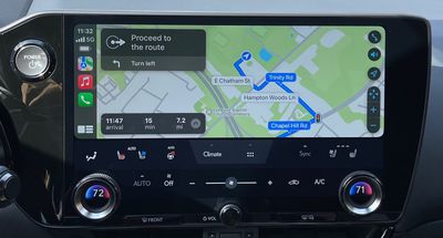
The widescreen display means you get a great CarPlay experience with apps like Apple Maps and Music, but it does also mean you can't see information from the native system alongside CarPlay, such as if you were listening to SiriusXM while navigating with Apple Maps.
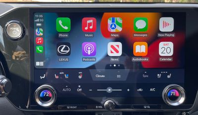
This generally didn't bother me in my time with the NX, as climate controls remain visible at all times, other frequently accessed functions can be found with a tap on a menu pop up, and information like the current song and channel for SiriusXM can be displayed in the digital cockpit.
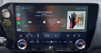
From the Lexus system, it's simple to hop into CarPlay if you've got your phone set up via wired or wireless connection. A CarPlay icon sits at the top left of the native system, letting you tap into CarPlay at any time. Getting out of CarPlay and back into the native system requires a few more steps, unfortunately, as you'll need to exit out of any app back to the main CarPlay home screen and tap on the Lexus icon. There is no hardware button or persistent software icon to get you out of CarPlay, although you can use Hey Lexus voice control to switch if you prefer.
Apple Music and Amazon Music
With the new infotainment system, Toyota is one of only a few car manufacturers to add support for direct streaming of Apple Music, as well as Amazon Music. The feature is available with Wi-Fi Connect service provided through an AT&T subscription.
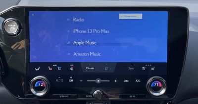
Apple Music works just fine through CarPlay of course, but Toyota wanted to give its customers the flexibility to be able to use Apple Music even while in the native system, and Toyota worked closely with the Apple Music team (which is separate from the CarPlay team) to implement the functionality as seamlessly as possible.
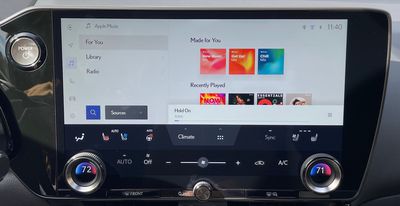
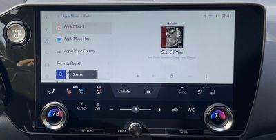
Using the Lexus app on your phone, you can authorize your Apple Music account, which then gives you full functionality with access to your playlists, radio stations, and more. The app design is a nice hybrid that makes it clear it's part of the core Toyota/Lexus system and yet it's still unmistakably Apple Music, with the traditional content options, album art, and more.
Digital Cockpit, Head-Up Display, and Steering Wheel Buttons
In addition to the large main infotainment screen, the Lexus NX also includes an all-digital cockpit, with the screen offering a variety of customizations with various styles and display options to choose from.
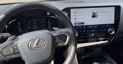
My test vehicle was also equipped with a 10-inch head-up display offering a bevy of information from a speedometer to the current speed limit, upcoming road signs, and more. A front cross-traffic sensor also shows in the head-up display, with prominent yellow arrows pointing left or right to warn you if you might be about to pull out in front of approaching vehicles.

The head-up display does support navigation prompts from Apple Maps in CarPlay, letting you keep tabs on upcoming turns without needing to glance away from the windshield. It's a very native-feeling experience that looks just like the prompts from the built-in navigation system.

One other interesting feature of the Lexus NX is the D-pads on the left and right sides of the steering wheel. These buttons are unlabeled with the exception of arrows, and that's because they can serve multiple sets of functions. A "page" button below each D-pad lets you cycle through the sets and the head-up display will show the function of each button in the currently selected set as you touch them and pause for a moment.
Connectivity and Ports
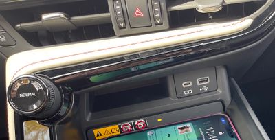
While wireless connectivity for CarPlay is convenient and simple, the 2022 NX also offers four USB ports for wired connections, headlined by a USB-A and a USB-C port up front. Only the USB-A port supports data for some reason, with the USB-C port being for charging purposes.
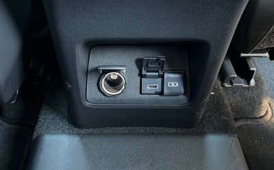
For rear passengers, there are two charge-only USB-C ports on the back of the center console.
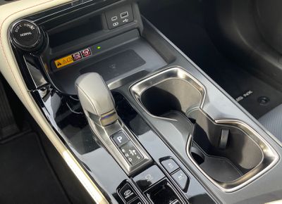
If you're sticking with wireless, the NX includes a clever design for the optional wireless phone charger, which is a flat tray that doubles as a cover for a storage bin near the base of the center stack. The cover slides back into the dash to reveal the storage compartment, hiding your phone away from both the temptation to pick it up while driving and general visibility if you leave it in the car.
I did, however, have significant issues with the charger, as it was unable to charge either my iPhone 13 Pro Max or iPhone 12 Pro Max with Apple's basic leather cases on them. After only a few seconds on the charger, charging stops and the status light by the charger begins blinking.
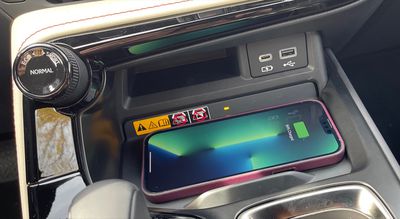
The phones are able to charge fine without cases, and an older iPhone 11 Pro Max charges with or without a case, so my suspicion is that the significantly thicker camera bumps and corresponding case lips for the latest Pro Max models are elevating the phone too much off of the flat charging surface, resulting in charging errors. My tester was a prototype vehicle and Toyota has passed my experiences along to its proper teams, so the company is optimistic that the issue can be addressed with a software update.
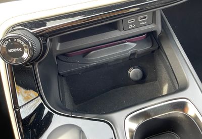
If they can get that charging issue fixed, this will be a great design for a wireless charger. I love the prominent placement that makes it easy to plop your phone down on it, coupled with the option to slide your phone away out of view as needed. The design also means the charger doesn't have to take up a significant amount of room.
The wireless charger is not included as standard equipment on any trims, and it comes as part of a rather pricey $450 package that also adds digital key and SmartAccess card key support. It's unfortunate that the feature requires the extra package, although it still represents a small fraction of the overall price of the car.
Wrap-up
The new Lexus Interface is a huge leap forward compared to the previous Lexus Enform system that used a cumbersome touchpad on the center console. With a revamped modern design, the option for a huge screen, wireless CarPlay, and Apple Music integration, it's a welcome improvement for Apple fans.
Overall, the native system is very responsive and CarPlay looks great on the big 14-inch screen. The climate controls are a thoughtful combination of hardware and software, and their implementation makes for a clean, easy-to-use look for the entire system.
Presuming the wireless charging issue I experienced can be fixed, that's also a solid design that pairs well with wireless CarPlay, although I do wish the charger was included as standard equipment.
Heavy CarPlay users will largely rely on their iPhones for features like navigation, so this may not be an issue for those users, but the subscription requirements for features like built-in navigation are unfortunate. There are certainly ongoing costs for Toyota to manage cloud-based navigation, but it does feel like a bit of nickel-and-diming for customers who have already shelled out quite a bit of money for their vehicles.
The 2022 Lexus NX starts at around $38,000, and it can go all the way up to over $60,000 fully equipped.
















Top Rated Comments
“It has CarPlay!”
“Right! Publish it!”
note to the reviewer : most of the pictures as closed detailed shots . People want to have perspective so that they can understand how design ideas collide with each other , is it fluent ? for instance, how is the steering wheel positioned in respect with the infotainment , what is passenger view with the rest of the dashboard ? Even if it's just a "screen" review, you should have captured all the other aspects.
If I was only doing school runs in the city and surplus cash it might be different. Even then hybrids like this car are more flexible.